august 2021 update
hey folks. it's uh... been a while.
it's really hard to work on the game in the way that i used to. but i still work on it, from time to time. here are some updates!
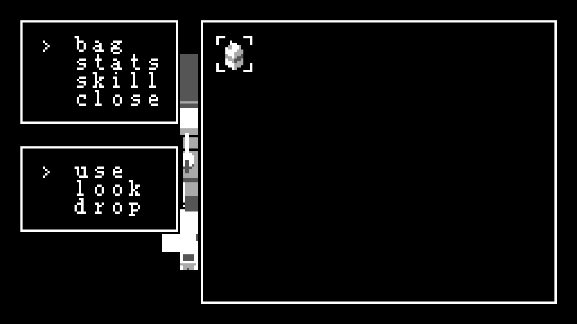
a very clean menu system:

this new system is made up of a system of menu objects. the "choice" menu on the side is an animated actor object (that draws its surface to the screen space, not the world space) which upon death, runs a premade script. if the choice chosen was "bag", it creates a new menu, this time with type "icons"! this one is an array of icons, which you can move the cursor around. when you do choose, it runs another premade script that checks which icon you picked, and so on!

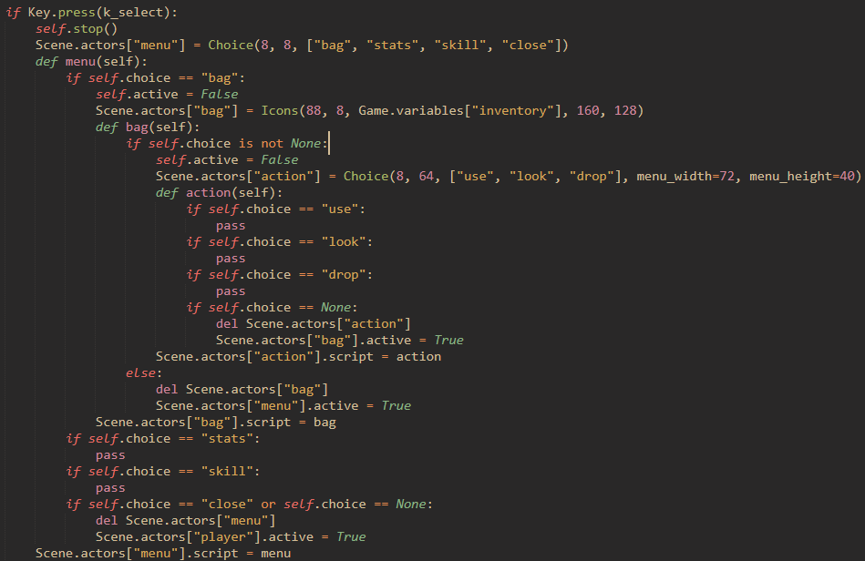
to show its simplicity better, this is the script implementing the inventory in its entirety. it's not pretty or easy to read, but it is incredibly efficient. here is a quick rundown.
- if the select (right shift) key is pressed:
- create a choice menu object with choices "bag", "stats", "skill" and "close".
- define this function and assign it to the choice menu, which runs when a choice is made:
- if choice is "bag":
- create a new icons menu object and fill it with objects stored in the player's inventory.
- define this function and assign it to the icon menu, which runs when a choice is made:
- if the player made a choice (selected an item, if they pressed "b" this is set to None):
- create a new choice menu object with the choices "use", "look", and "drop".
- define this function and assign it to the choice menu:
- checks choice, not implemented yet. if None, delete the action menu and "re-highlight" the inventory.
- if the choice is none, delete the inventory and "re-highlight" the original choice menu.
- if the player made a choice (selected an item, if they pressed "b" this is set to None):
- if choice is "close", close all menu
- if choice is "bag":
that's all. 9-slice menu drawing, text rendering, cursor drawing an animation, all done by the objects themselves. also, regular dialogue boxes and static text boxes fit into this new system as well. creating complicated menu structures is VERY easy now. (side note, text editor is Sublime Text 3 unlicensed version, with color scheme "Gruvbox Material Dark").
another thing i did was... per-pixel lighting! you might notice that the color palette is different in the in-game screenshot. it is! before, i had chosen 4 arbitrary grays to use. it looked nice, and "warm", as much as gray can be. but when brainstorming the concept of per-pixel lighting, i came across an incredibly simple but beautiful fact:
3 * 85 = 255.
it's a miracle! my friends, this is a miracle. you're telling me that this whole time, there have been four evenly spaced (integer) grayscales?! these are my new colors. (0, 0, 0), (85, 85, 85), (170, 170, 170), and (255, 255, 255). i love this. but beyond these being beautiful numbers, they have incredibly interesting properties when it comes to addition and subtraction color blending modes. if you have a white pixel, with RGB value (255, 255, 255), and then you subtract from it a dark gray pixel (85, 85, 85), you get the light gray pixel!! (170, 170, 170). done across every pixel on the screen, subtracting an image filled with dark gray color will darken each pixel by one value, black staying black. take this image for example:

now imagine that this image will be the image that you subtract from the screen. the black pixels have a value of (0, 0, 0) and anything minus zero doesn't change, so those pixels won't change. however, the pixels "under" the dark gray pixels will shift down by one color, the light gray will shift down by two, and the white will shift down by three. this has the affect of making a color gradient across the screen. this is what this light map looks like when applied on the screen.

isn't it fantastic? this is live, per-pixel lighting while never straying away from the four color palette. the lighting is completely dynamic too. a flickering candle. a lamp to take you through the dark cave. a lamp post illuminating a drenched car filled with drowned skeletons.
i love it! this is an incredibly powerful atmospheric tool, and i think it's a great addition to the game. i don't know much about dithering algorithms, but i'm sure dithering would look fantastic here. also, scene transitions have been reimplemented with a global light value using this new system.
the next thing is a few new additions to the character creator. i added 3 accessory slots for things ranging from stripes on your shirt to devil horns to angel halos to... a suit of armor. that one's pretty cool. a small new addition, but crucial if i want to make a competent character creator.
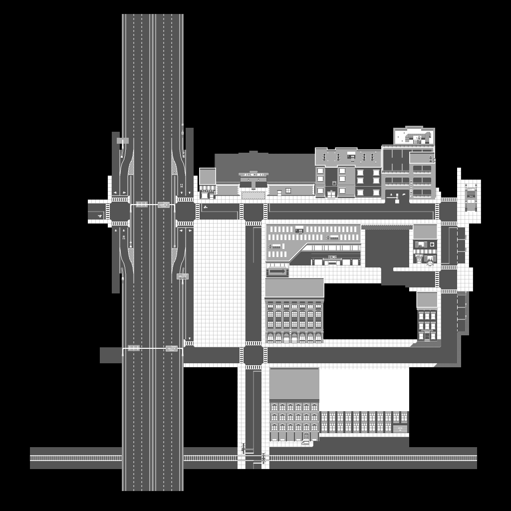
i've worked more on the city. this is a scaled-down version of what i have so far.

... a big freeway, piercing through the city. here's the thing. i absolutely love cities. i love being able to walk to cvs at midnight, i love driving on freeways, i like attending concerts in downtown. there are so many small details in a city. traffic signs. light poles. parking meters. garages. bold vs. dotted street lines. i want to fit these things that i love into the city. the layout has changed a little bit. there is a new railway to the south of the city. i'm not sure if it will replace the northern railway in my earlier diagrams, but hey, who cares if there are 2 railways. it's my game, goddammit, and i love trains. i've blocked out the area meant for the hospital (the concrete plane in the center), as well as a few other details here and there. most of what's here is from a time when i used the darkest color sparingly, which i want to avoid in order to get the most out of the new lighting system. all that is just to say that colors might change in the future.
the final thing is really difficult for me. you might be familiar with the format of the game so far. you might also know that recently a game has come out with... extremely similar ideas. i've known about that game for a long time and i've never followed the development closely, but the fact that i came up with the idea independently doesn't really matter to me. i really value uniqueness. i really want to be different from everything else. even if i were able to bring my idea to fruition in the exact way i imagined it, the idea that it would be similar to another game makes me feel... gross.
i'm in love with my game. i'm in love with my ideas, and my vision for my game. so when these two things came together in conflict, it really destroyed my motivation.
but still, i work. i paint new buildings in the city. i rewrite some old code that doesn't make much sense anymore. i reimagine the actor object inheritance structure in the source code. i come up with new ideas, new tools. i'm considering new formats to replace my old ideas. i think the game may change a lot in the future.
a lot of time has passed since my last devlog. i've relearned how to play the piano, i've picked up poetry, i've learned the basics of quantum superposition (not well), i've learned about the history of China, and about the black hole at the center of the galaxy.
yes, a lot of time has passed.
but i still love this game.
and i still love you.
thank you for reading.

Get ski butters
ski butters
| Status | In development |
| Author | bennett |
| Genre | Role Playing, Adventure |
| Tags | 2D, Pixel Art, Post-apocalyptic, Top-Down, Turn-Based Combat |
| Languages | English |
More posts
- ski butters, second releaseJul 15, 2020
- making things personalJul 09, 2020
- my plansJun 06, 2020
- reworked text formatter + started summer classesMay 24, 2020
- menu/inventory + save system reworkMay 10, 2020
- work on big cityApr 30, 2020
- inventory format ideasApr 29, 2020
- big city digital tour!Apr 28, 2020
- fun actor programming updateApr 28, 2020
Leave a comment
Log in with itch.io to leave a comment.